Mapping Central and Marginal Areas - Example: Assessment of social infrastructure deficits in rural areas in Ethiopia
 |
Background Rural areas in the majority of developing countries often lack social infrastructure facilities, and in many cases, they are characterized by a high demand for products and services with central functions. Socioeconomically sound planning of infrastructure facilities plays a major role in rural development. Taking into account the basic needs of the local population, appropriate measures have to be taken, in order to improve the structural deficits and to satisfy the demands of the people. The quality of life is highly dependent on the distance to products and services, which are important for the people. Nevertheless, decisionmakers on regional level often mention the lack of reliable and accurate planning data as a major obstacle for rural development. But, in many cases, it is not the data that is missing, but rather user-driven information products that can facilitate infrastructure planning. The Land Use Planning and Resources Management Project in Oromia Region (LUPO) of the German Technical Cooperation (GTZ) has been operating in Ethiopia since 1997. LUPO’s objective is to develop and implement an appropriate concept for land use planning (LUP) and natural resources management (NRM) with the local communities. The project follows a participation-oriented approach, incorporating also Technical innovations, such as remote sensing data and Geographic Information Systems (GIS) in its activities. Components of the Centrality Analysis In a first step, raster images that show cost distances to the various infrastructure facilities were generated, based on topographic maps in a scale 1:50,000. The cost distance layers were generated under the consideration of slope gradients and the land cover acting as forces and/or frictions. The cost distance images then served as a major input for the generation of raster surfaces that express the degree of centrality and marginality of each location. A surface of the population density then served as an additional input for the generation of the final information product that shows the availability of infrastructure facilities throughout the area under investigation. The following section describes the input data and the methodology of the GIS-analysis that was applied to map and evaluate the following qualitative indicators:
Centrality and Marginality: In scope of the analysis both, vector and raster data were used. The ground resolution for all raster GIS analysis steps was 50 meters. The following gives an overview of the GIS-analysis steps, incorporated into the modelling process (Figure 2). All analysis steps were realised with the commercial software products ARC/INFO, ArcView and IDRISI. Figure 2: GIS model for the assessment of infrastructure deficits in rural areas
|
 |
In order to analyse and describe the centrality/marginality within the project area, cost distances to all major infrastructure facilities, which are described on the Topographic Maps 1:50,000, were assessed with the GIS. It was decided to accommodate the frictional effects of the slope gradient as an anisotropic cost surface, while the land cover and major rivers served to consider isotropic costs. In a first step, all vector information on the Topographic Maps 1:50,000, including the land cover had to be digitized. The land cover polygons then served as input for the isotropic cost surface, which classifies the friction that occurs when traversing different land cover types, while assuming that there is no footpath. Friction values were then estimated, based on own experience from the field (Table 1). It was assumed that it is the easiest to walk on asphalt roads, sand or over cultivated land, as opposed to crossing a river, which takes more time. Table 1: Friction values of different land cover types for isotropic cost surface
In order to simulate the frictional effects of the slope gradient, a Digital Elevation Model (DEM) was generated by surface interpolation of 20-m contour lines and spot heights from topographic maps in a scale 1:50,000. The DEM shows that the project area is characterised by very high relief energy between the highland plateau and the deep valley gorges (Map 3, 4, 5). The determination of the slope gradient was achieved by calculating maximum slope around each pixel from local slopes in X and Y. The following classification scheme shows all occurring slope gradient classes and respective friction values that were again estimated, based on own field experience (Table 2). Table 2: Friction values of slope gradient classes for anisotropic cost surface
|
|
|
The direction of slopes affects the efforts needed to cross an area, depending on the direction of movement. This made it necessary to produce a direction image of maximum frictional effects. It was generated by the additive overlay of an aspect image, and a reverse aspect image, whose direction of movement corresponds with the friction of slope gradients. Both input images were calculated by analysing the DEM. Based on these input layers, a surface of cost distances to all known infrastructure facilities was then calculated. The Table 3 describes all source features, from which relative cost distances were calculated. Table 3: Description of infrastructure facilities, to which cost distances were calculated
|
 |
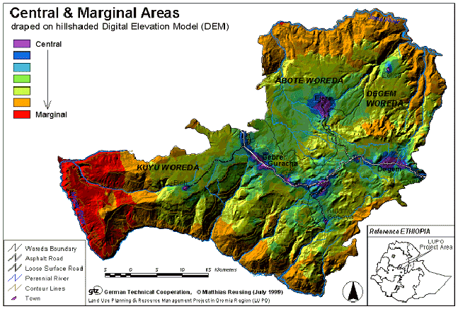
Finally, the seven cost distance layers were combined by a multiplicative overlay, in order to create a new information product. The resulting image can serve as a qualitative indicator for the relative centrality/ marginality of any location within the project area (Map 3). Map 3: Central & Marginal Areas
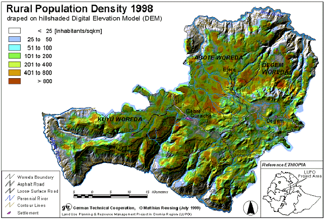
Rural Population Density 1998 Population density layers give an impression of the spatial distribution of people living in the area under investigation. In order to produce such an information product, in a first step, the hut density/sqkm had to be calculated. Therefore, the point signatures representing the huts on the topographic maps 1:50,000 - produced by aerial photographs from 1980 - were digitized. After a vector to raster conversion, a hut density surface was created. This image was then multiplied with the average household size (± 6 people/hut) in order to calculate the population density for the year 1980. Finally, the average annual population growth rate (= 2.23) within Oromia region was incorporated into the model, assuming that it was similar for the last 18 years. It has to be mentioned that movements due to migration were incorporated into the model, as their influence was not considered as significant. The analysis steps resulted into a population density layer for the year 1998 (Map 3). Table 4 gives a statistical overview of the rural population density in 1998. Between 1980 and 1998, the total population has grown by around 48 %. Table 4: Rural Population Density 1998
Map 4: Rural Population Density 1998
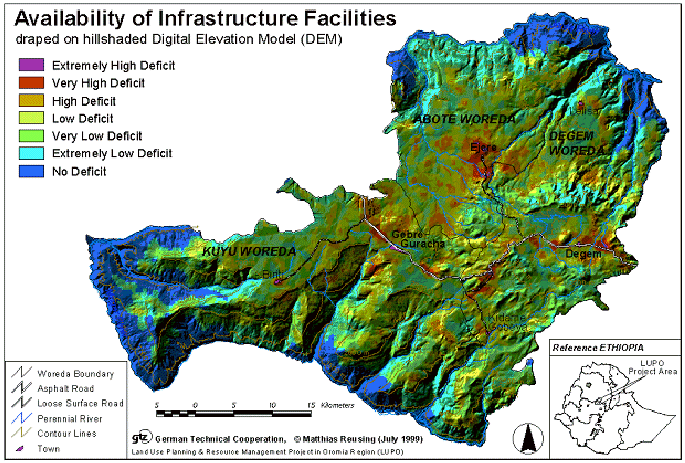
Availability of Infrastructure Facilities Both, the layer of ‘Central & Marginal Areas’ and of the ‘Rural Population Density 1998’ serve as input for further socio-economic analysis. In fact, the image of the ‘Availability of Infrastructure Facilities’ was produced by a simple multiplicative overlay of the above mentioned two information products. The resulting values were then reclassified into seven individual classes, which gradually indicate the need for new infrastructure facilities in classes from ‘no deficit’ up to an ’extremely high deficit’ (Map 5). Table 5: Availability vailability of Infrastructure Facilities
The resulting map shows that there is a general demand on infrastructure facilities within most of the project area. The comparison of the generated information products shows that very high and extreme deficits are prevailing in all central areas with a very high population density. High deficits are prevailing in the densely populated parts of the project area at a transitional zone with a central to marginal character. In contrast to this, along the sparsely populated bottom of the deep valley gorges, there seems to be no need for additional infrastructure facilities. Finally, the deficit is low to very low whenever both, the rural population density and the centrality/marginality image show average values. For more specific evaluations of the necessity for the improvements with regard to specific infrastructure facilities, the described analysis steps should always be repeated separately with the respective cost distance layer. Map 5: Availability of Infrastructure Facilities
|